Recently I have been watching documentaries by Gary Hustwit. It started with Rams, about the life of Dieter Rams. Next, Urbanized about city design. Then, Helvetica about the popular font.
As I watched Helvetica, I confronted the fact that Contraption Company used the Helvetica font. I saw designers talking about the beauty of Helvetica: a revolutionary, canonical font. But also that it was generic, used for everything, becoming ambient and insipid. During the documentary, I decided it was time to stop using Helvetica and refresh the Contraption website.
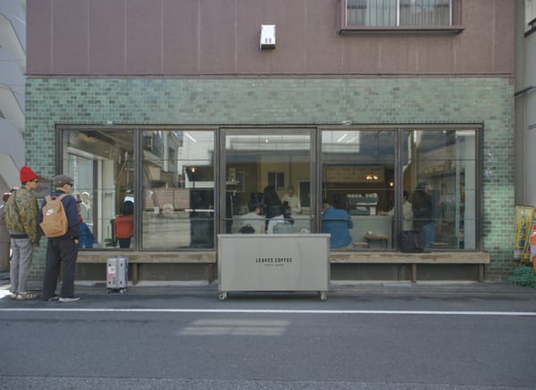
The recent Contraption site was influenced by modern, minimalist Norwegian websites, such as Dekode, Netlife, and Snøhetta. As a non-designer, I gravitate towards minimalism because limited palettes seem safe and hard to screw up. But I was ready for something more distinctive. I was inspired by sites like Aimé Leon Dore, Soho House, and Noma Projects for a refresh that is still modern but brings in more character.
I started with the fonts. I explored Berkeley Mono, which I use for coding. I liked FF Meta. Playtype in Copenhagen had some cool options. But I was ultimately enamored by the fonts from the Klim Type Foundry in New Zealand, settling on Söhne paired with Tiempos.
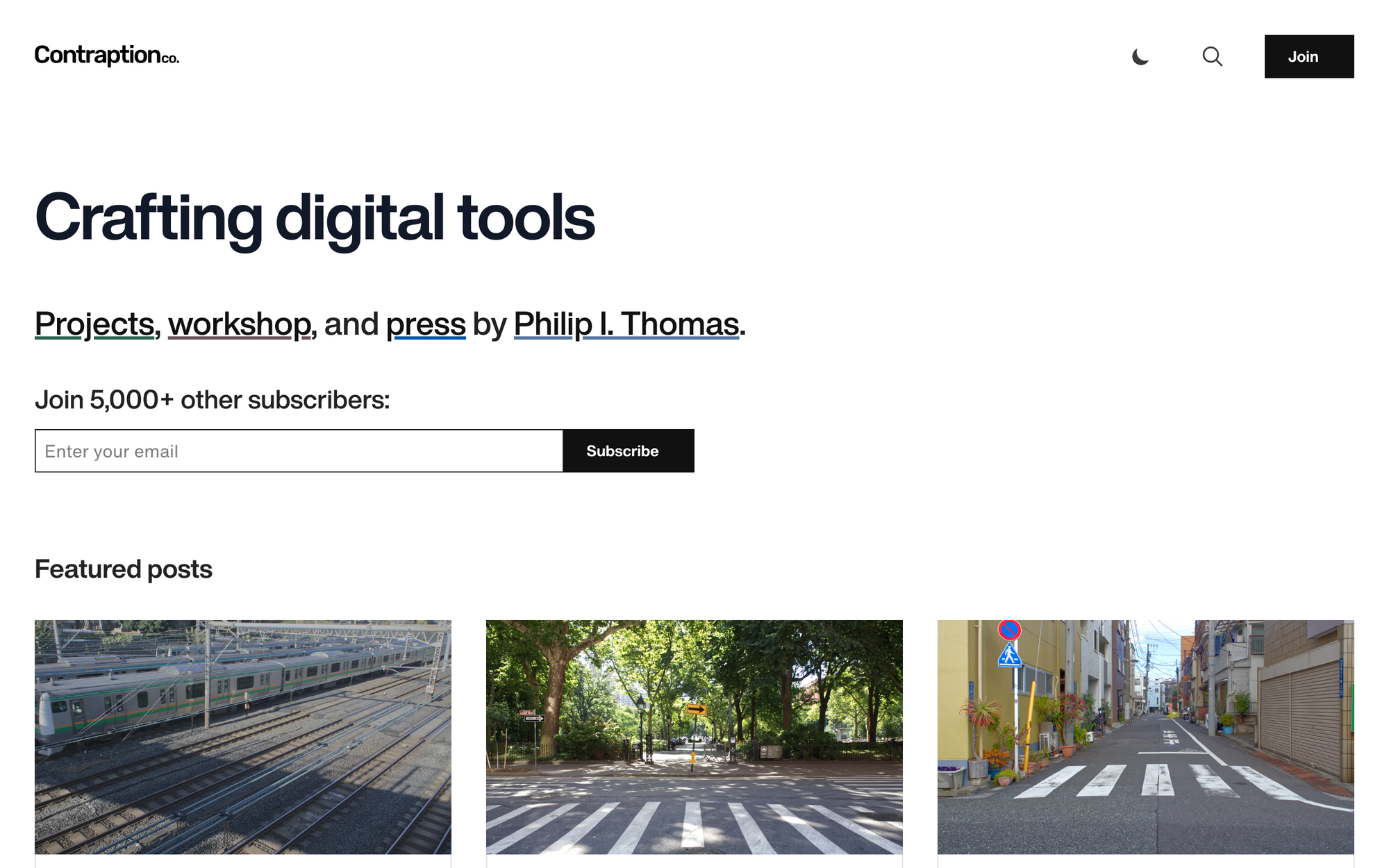
Over the long weekend, I rewrote the entire theme with the help of Claude Code. At first glance, the site still looks minimal. But there is more color, more interactions, updated pages like Projects, and subtly different moods for different corners like Workshop. I wanted the website to feel like a maze: something you explore, with texture and surprises around each corner.
One decision I made was to remove dark mode support. Somebody recently told me that dark mode frenzy was a sign that the technology industry was bored before the rise of AI. Supporting both light and dark mode makes sites converge to the same generic shadcn/ui look. Generic can be good for software tools that people use all day, like Notion. But for a more niche site, looking generic keeps you from being interesting or memorable. Without that constraint, I made the site visually interesting to explore, like the entirely inverted 404 page.
Take a look, explore some pages, and let me know what you think. Now, back to the documentary queue.
P. S. - the Print Edition template has been updated, too.
I did want [Stratechery] to be visually distinct. I did like a custom font, which back then was very rare. That was a new thing. I had the orange. There weren't very many orange sites back then. And I did a lot of these hand drawings, which were very visually distinct. [. . .] The reason for that is, what I was really thinking about was, oh, they follow an article, like, oh, that is a good article. A day later, a week later, a month later, they follow another link. They're like, wait, I've been on this site before, it's triggering my memory. That's really, I think, the key moment.
- Ben Thompson on Acquired